CSS / Reference / align-content
목차
개요
- flex-wrap 속성의 값이 wrap인 경우, 아이템들의 가로폭의 합이 콘테이너의 가로폭을 넘어가면 아이템이 다음 줄로 내려갑니다. 이때 여러 줄이 되어버린 아이템들의 정렬을 어떻게 할지 정하는 속성이 align-content입니다.
문법
align-content: stretch | center | flex-start | flex-end | space-between | space-around | space-evenly | initial | inherit
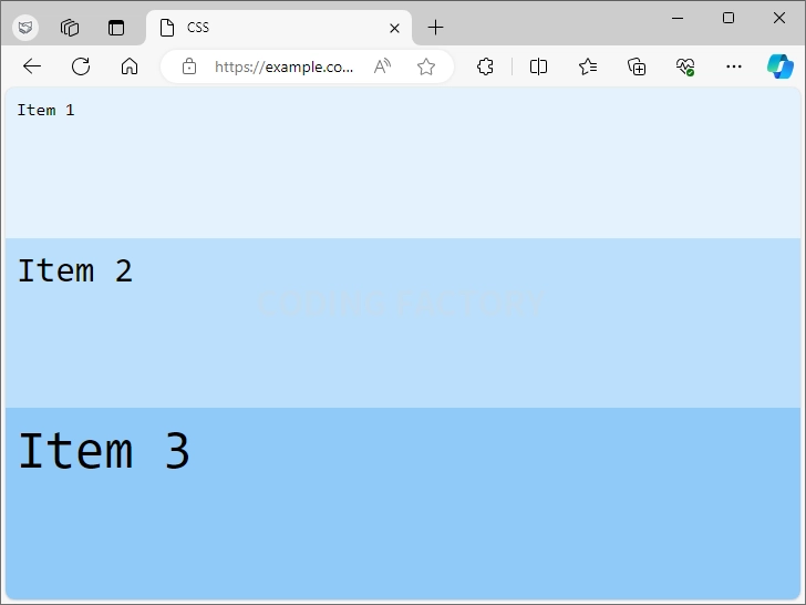
- stretch : 기본값으로, 높이를 꽉 채웁니다.
- flex-start : 위쪽부터 채웁니다.
- center : 가운데에 배치합니다.
- flex-end : 아래쪽부터 채웁니다.
- space-between : 세로 간격을 동일하게 만듭니다.
- space-around : 아이템의 위 아래 간격을 동일하게 만듭니다.
- space-evenly : 맨 위와 맨 아래의 간격을 포함하여 세로 간격을 동일하게 만듭니다.
- initial : 기본값으로 설정합니다.
- inherit : 부모 요소의 속성값을 상속 받습니다.
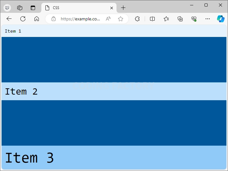
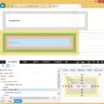
예제 - stretch
- 기본값은 stretch로, 높이를 꽉 채웁니다.
<!doctype html>
<html lang="ko">
  <head>
    <meta charset="utf-8">
    <title>CSS</title>
    <style>
      body {
        box-sizing: border-box;
        margin: 0px;
        font-family: Consolas, monospace;
      }
      .jb-container {
        height: 100vh;
        background-color: #01579b;
        display: flex;
        flex-wrap: wrap;
        align-content: stretch;
      }
      .jb-item {
        width: 100%;
        padding: 10px;
      }
      .jb-item:nth-child(1) {
        background-color: #e3f2fd;
      }
      .jb-item:nth-child(2) {
        background-color: #bbdefb;
        font-size: 2em;
      }
      .jb-item:nth-child(3) {
        background-color: #90caf9;
        font-size: 3em;
      }
    </style>
  </head>
  <body>
    <div class="jb-container">
      <div class="jb-item">Item 1</div>
      <div class="jb-item">Item 2</div>
      <div class="jb-item">Item 3</div>
    </div>
  </body>
</html>
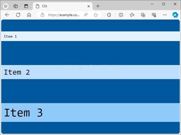
예제 - flex-start
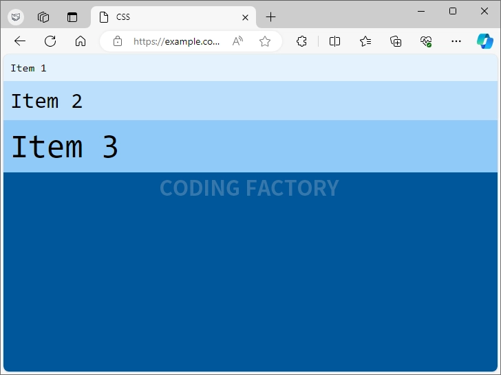
- align-content의 값을 flex-start로 정하면 위쪽부터 채웁니다.
.jb-container {
  height: 100vh;
  background-color: #01579b;
  display: flex;
  flex-wrap: wrap;
  align-content: flex-start;
}
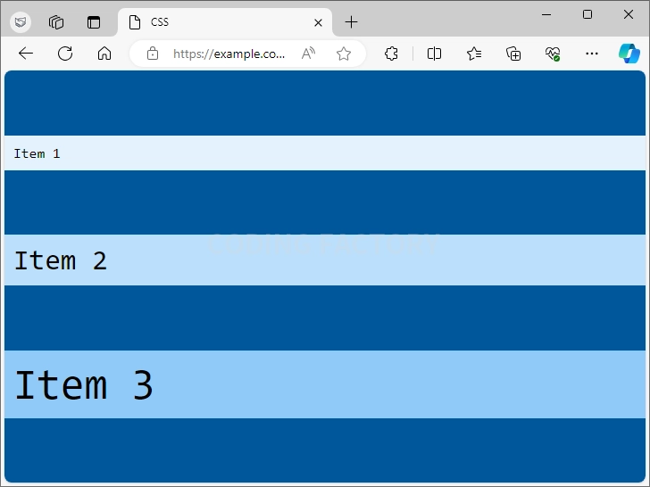
예제 - center
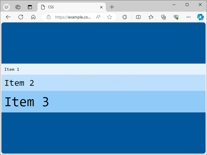
- align-content의 값을 center로 정하면 가운데에 배치합니다.
.jb-container {
  height: 100vh;
  background-color: #01579b;
  display: flex;
  flex-wrap: wrap;
  align-content: center;
}
예제 - flex-end
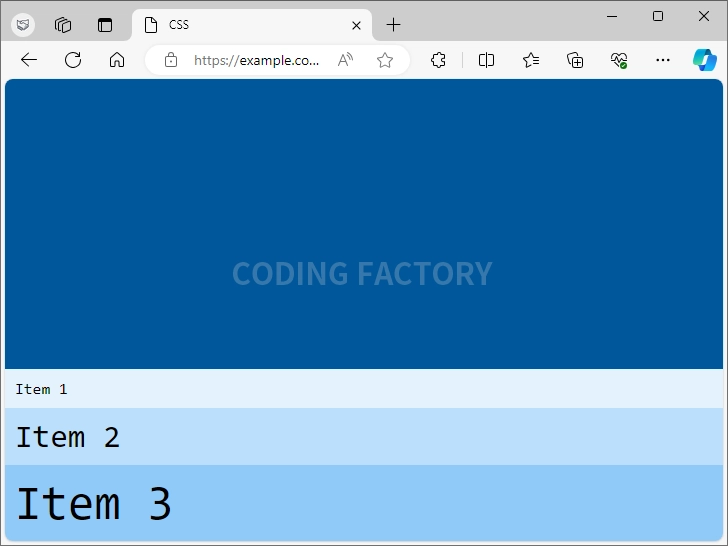
- align-content의 값을 flex-end로 정하면 아래쪽부터 채웁니다.
.jb-container {
  height: 100vh;
  background-color: #01579b;
  display: flex;
  flex-wrap: wrap;
  align-content: flex-end;
}
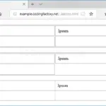
예제 - space-between
- align-content의 값을 space-between로 정하면 세로 간격을 동일하게 만듭니다.
.jb-container {
  height: 100vh;
  background-color: #01579b;
  display: flex;
  flex-wrap: wrap;
  align-content: space-between;
}
예제 - space-around
- align-content의 값을 space-around로 정하면, 아이템의 위 아래 간격을 동일하게 만듭니다.
.jb-container {
  height: 100vh;
  background-color: #01579b;
  display: flex;
  flex-wrap: wrap;
  align-content: space-around;
}
예제 - space-evenly
- align-content의 값을 space-evenly로 정하면, 맨 위와 맨 아래의 간격을 포함하여 세로 간격을 동일하게 만듭니다.
.jb-container {
  height: 100vh;
  background-color: #01579b;
  display: flex;
  flex-wrap: wrap;
  align-content: space-evenly;
}
CSS / Reference / aspect-ratio
aspect-ratio는 선택한 요소의 가로 세로 비율을 정하는 속성입니다. 접속하는 기기의 해상도가 변해도, 일정한 가로 세로 비율을 유지하고 싶을 때 유용하게 사용할 수 있습니다.
CSS / Reference / background-origin
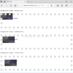
HTML 요소는 박스로 이루어져 있고, 바깥 여백 영역(Margin Area), 테두리 영역(Border Area), 안쪽 여백 영역(Padding Area), 내용 영역(Content Area)으로 구분합니다. background-origin으로 배경 이미지를 어느 영역부터 채워나갈지를 정합니다. 기본값 : padding-box 상속 : No 애니메이션 : No 버전 : CSS Level 3
들여쓰기와 내어쓰기는 text-indent 속성으로 만듭니다. 값이 양수이면 들여쓰기, 값이 음수이면 내어쓰기가 됩니다. 내어쓰기를 할 때는 왼쪽에 여백을 적절히 줍니다.
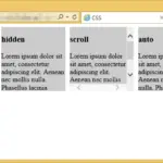
overflow는 내용이 요소의 크기를 벗어났을 때 어떻게 처리할지를 정하는 속성입니다. 기본값 : visible 상속 : No 애니메이션 : No 버전 : CSS Level 2
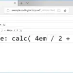
calc()는 괄호 안의 식을 계산한 결과를 속성값으로 사용하게 해주는 함수입니다. 예를 들어 다음은 는 글자 크기를 20px로 설정합니다. font-size: calc( 10px + 10px );
box-sizing은 박스의 크기를 어떤 것을 기준으로 계산할지를 정하는 속성입니다. 기본값 : content-box 상속 : No 애니메이션 : No 버전 : CSS Level 3

opacity로 요소의 투명도를 정할 수 있습니다. 기본값 : 1 상속 : No 애니메이션 : Yes 버전 : CSS Level 3
empty-cells은 표(table)에서 빈 셀의 테두리를 표시할지 말지는 정하는 속성입니다. 기본값 : show 상속 : Yes 애니메이션 : No 버전 : CSS Level 2
CSS / Reference / background-image
background-image는 이미지를 배경으로 사용하게 하는 속성입니다. 기본값 : none 상속 : No 애니메이션 : No 버전 : CSS Level 1
CSS / Reference / list-style-position
list-style-position으로 ul, ol 등의 목록의 마커(marker)의 위치를 정합니다. 기본값 : outside 상속 : Yes 애니메이션 : No 버전 : CSS Level 1