CSS / Reference / white-space
개요
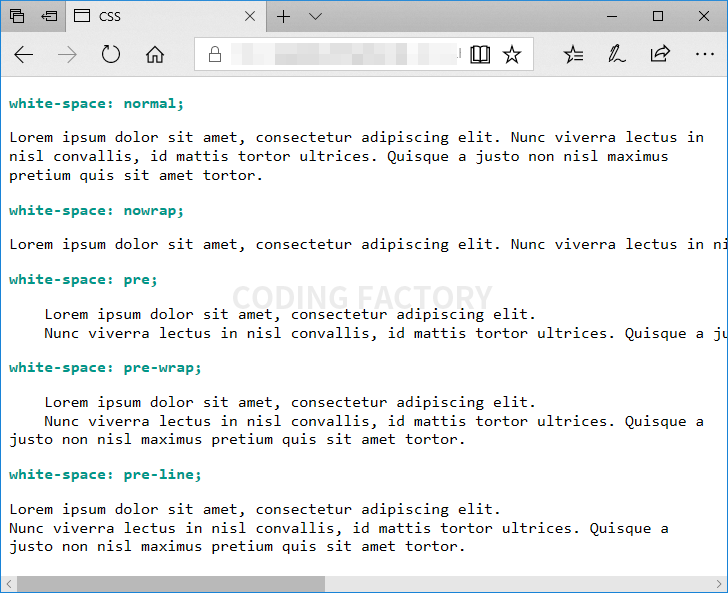
white-space는 스페이스와 탭, 줄바꿈, 자동줄바꿈을 어떻게 처리할지 정하는 속성입니다.
- 기본값 : normal
- 상속 : Yes
- 애니메이션 : No
- 버전 : CSS Level 1
문법
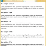
white-space: normal | nowrap | pre | pre-wrap | pre-line | initial | inherit
- normal, nowrap, pre, pre-wrap, pre-line : 아래 표 참고
- initial : 기본값으로 설정합니다.
- inherit : 부모 요소의 속성값을 상속받습니다.
| 스페이스와 탭1 | 줄바꿈2 | 자동 줄바꿈3 | |
|---|---|---|---|
| normal | 병합 | 병합 | O |
| nowrap | 병합 | 병합 | X |
| pre | 보존 | 보존 | X |
| pre-wrap | 보존 | 보존 | O |
| pre-line | 병합 | 보존 | O |
- 연속된 스페이스와 탭의 처리 방법입니다. 병합은 1개의 공백으로 바꾸는 것이고, 보존은 입력된 그대로 출력하는 것입니다.
- 줄바꿈의 처리방법입니다. 병합은 1개의 공백으로 바꾸는 것이고, 보존은 입력된 그대로 출력하는 것입니다.
- 내용이 영역의 크기를 벗어날 때 처리방법입니다. O는 자동으로 줄바꿈하여 영역 내에 내용을 표시하는 것이고, X는 영역을 벗어나더라도 입력된 대로 출력하는 것입니다.
예제
<!doctype html>
<html lang="ko">
<head>
<meta charset="utf-8">
<title>CSS</title>
<style>
p {
font-family: Consolas;
font-size: 16px;
}
.t {
font-weight: bold;
color: #009688;
}
.a {
white-space: normal;
}
.b {
white-space: nowrap;
}
.c {
white-space: pre;
}
.d {
white-space: pre-wrap;
}
.e {
white-space: pre-line;
}
</style>
</head>
<body>
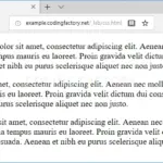
<p class="t">white-space: normal;</p>
<p class="a"> Lorem ipsum dolor sit amet, consectetur adipiscing elit.
Nunc viverra lectus in nisl convallis, id mattis tortor ultrices. Quisque a justo non nisl maximus pretium quis sit amet tortor.</p>
<p class="t">white-space: nowrap;</p>
<p class="b"> Lorem ipsum dolor sit amet, consectetur adipiscing elit.
Nunc viverra lectus in nisl convallis, id mattis tortor ultrices. Quisque a justo non nisl maximus pretium quis sit amet tortor.</p>
<p class="t">white-space: pre;</p>
<p class="c"> Lorem ipsum dolor sit amet, consectetur adipiscing elit.
Nunc viverra lectus in nisl convallis, id mattis tortor ultrices. Quisque a justo non nisl maximus pretium quis sit amet tortor.</p>
<p class="t">white-space: pre-wrap;</p>
<p class="d"> Lorem ipsum dolor sit amet, consectetur adipiscing elit.
Nunc viverra lectus in nisl convallis, id mattis tortor ultrices. Quisque a justo non nisl maximus pretium quis sit amet tortor.</p>
<p class="t">white-space: pre-line;</p>
<p class="e"> Lorem ipsum dolor sit amet, consectetur adipiscing elit.
Nunc viverra lectus in nisl convallis, id mattis tortor ultrices. Quisque a justo non nisl maximus pretium quis sit amet tortor.</p>
</body>
</html>
clip 속성으로 요소의 특정 부분만 나오도록 할 수 있습니다. 기본값 : auto 상속 : No 애니메이션 : Yes 버전 : CSS Level 2
font-weight 속성은 CSS에서 글꼴의 굵기를 지정하는 데 사용됩니다. 텍스트의 가독성을 높이거나 디자인의 강조점을 표현할 때 유용합니다. 기본값 : normal 상속 : Yes 애니메이션 : Yes 버전 : CSS Level 1
CSS / Reference / border-style
border-style은 테두리(border)의 모양을 정하는 속성으로, 다음 속성의 단축 속성입니다. border-top-style border-right-style border-bottom-style border-left-style
line-height 속성은 텍스트 줄 간격(줄 높이)을 조절하는 데 사용됩니다. 텍스트의 가독성을 높이고, 디자인적으로 더 일관된 레이아웃을 만들기 위해 자주 사용됩니다. 기본값 : normal 상속 : Yes 애니메이션 : Yes 버전 : CSS Level 1
text-align은 문단 정렬 방식을 정하는 속성입니다. 기본값 : 읽는 방향이 LTR(왼쪽에서 오른쪽)인 경우 left, RTL(오른쪽에서 왼쪽)인 경우 right 상속 : Yes 애니메이션 : No 버전 : CSS Level 1
CSS / Reference / border-width
border-width은 테두리(border)의 두께를 정하는 속성으로, 다음 속성의 단축 속성입니다. border-top-width border-right-width border-bottom-width border-left-width
CSS / Reference / background-clip
HTML 요소는 박스(box)로 이루어져 있습니다. 배경 이미지나 배경색을 그 박스 중 어디에 넣을 지 정하는 속성이 background-clip입니다. 기본값 : border-box 상속 : No 애니메이션 : No 버전 : CSS Level 3
들여쓰기와 내어쓰기는 text-indent 속성으로 만듭니다. 값이 양수이면 들여쓰기, 값이 음수이면 내어쓰기가 됩니다. 내어쓰기를 할 때는 왼쪽에 여백을 적절히 줍니다.
CSS / Reference / background-position
background-position은 배경 이미지의 위치를 정하는 속성입니다. 기본값 : 0% 0% 상속 : No 애니메이션 : Yes 버전 : CSS Level 1

CSS / Reference / background-size
background-size는 배경 이미지의 가로 크기와 세로 크기를 정하는 속성입니다. 기본값 : auto 상속 : No 애니메이션 : Yes 버전 : CSS Level 3